I lead the operations of a small technology Saas company from £0-£1M ARR. You can find my template for calculating every metric you might need here.
I’ve been both on the analyst side of analyzing data rooms and producing them. In my experience, with all of the classic VC benchmarks – the devil is in the details. A different subtle difference in calculation can move you from an ‘average’ company to a ‘great’ one, and often the nuances between the calculations are nuanced enough that many miss them.
My approach is to be clear about what question you are trying to answer, and use a few different calculations to try to access that question. If you just rely on one calculation, you’ll find that there are many biases hidden inside it. It might make you believe your business is better than it is, or the opposite.
You can see the below as a simple course on generating an accurate NRR number. Alternatively, if you are raising money from investors – you could also see the below as a guide on how to lie with numbers. Unfortunately, they are always two sides of the same coin.
What is Net Revenue Retention?
The question you are trying to answer with the Net Revenue Retention metric is the following:
If you close 1 dollar/pound of new MRR, what happens to that dollar in the future?
The Americans call the same metric “Net Dollar Retention” which I think is an easier name to visualize.
In order to explain the above further, imagine a new customer signs up to pay $1 a month. A few things could happen to that initial dollar:
- Churn: The customer could ‘churn’, which means you lose the dollar (0% NRR for that Customer)
- Retain: The customer could renew at the same subscription cost which means you maintain the dollar (100% NRR for that Customer)
- Upsell: The customer could renew at a higher price point (200% NRR for that Customer if they double their monthly contract).
The NRR number averages out across a certain number of customers to understand how a dollar progresses. Obviously, the higher the NRR the better that means for your business.
Benchmarks for NRR
On average, if your NRR is below 100%, it means your churn outpaces your upsells. Investors might see this as evidence of a “leaky bucket,” with the idea that filling up a bucket which is leaking is not a good use of their investor capital.
Investor Benchmarks are the following (from Craft Ventures):
- Sub 100%: Warning
- 100%-120%: Good
- 140%+: Great
The Hidden Details
The metric looks fairly simple. Unfortunately, the simple way I framed the question had some hidden ambiguities in it which affect the outcome.
Let’s look at the question we started with:
If you close 1 dollar/pound of new MRR, what happens to that dollar in the future?
The ambiguities are [which dollar to include] and what is [the future].
In terms of ‘which dollar to include’ you may think to include all your customers – but there are a variety of principled and pragmatic reasons why that might not be best. A simple example might be in the case of a ‘pivot’, you wouldn’t want to include ‘pre pivot’ customers with ‘post pivot’ if the pivot was very substantial.
The ‘future’ refers to how far in the lifecycle of a customer to look. A customer might have an NRR of 100% over one year, 150% over two years and 300% over 10 years. Which number do you want to look at?
So, while NRR is always about a subset of customers, you still have both choice of which customers to include, and how far into the lifecycle to look for those customers. So you need to answer:
- Which customers are you looking at?
- What do you see as the lifecycle worth monitoring? (12 months, 18 months, 24 months etc.)
You will want to look at a combination of both of the above, in order to decide both which number to present to investors and which numbers are useful to track. I have attached a bit more detail on the above below:
Which Customers to Look At
You have a few options for choosing which customers to look at:
- Batch Analysis: All Customer from a Certain Date, presented as a single number
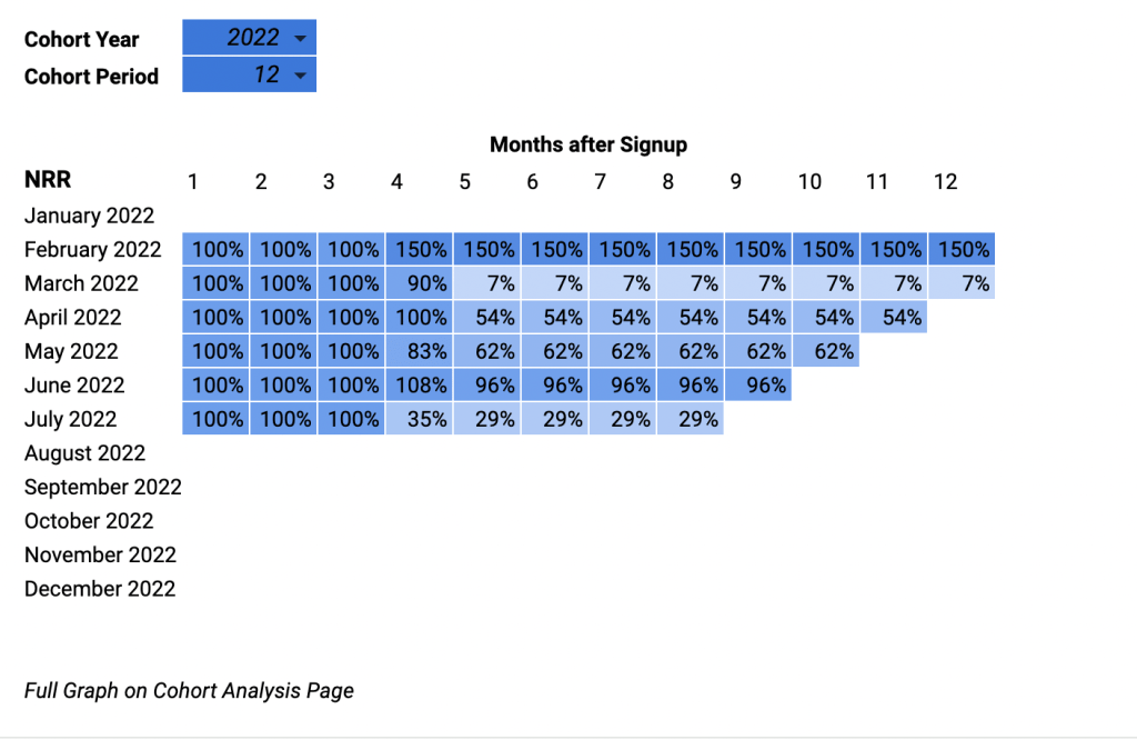
- Cohort Analysis: Only New Customers over time, presented as a cohort analysis as below.
In a Batch Analysis, you would take all customers live in say February 2020, and look at how their spending has changed over the next 12, 18 or 24 months.
In a Cohort Analysis, you would be looking just at those customers who signed in February 2020, and looking at how their spending developed. Cohort Analysis is often seen as the gold standard, but sometimes can be misleading or not paint a clear picture of the business.
I recommend you use my template to workout both, and have a think about what it is telling you about your business. You can also read my examples to help you think around these metrics and how they vary.
What do you see as the lifecycle worth monitoring?
Most people choose a 12 month NRR, which means “of the customers you had twelve months ago, how much money do those customers spend with you now” or in the case of a cohort analysis, display the changes month on month.
If you start from that number, you can then choose to modify either:
- Which 12 month period you look at – sometimes August to September can produce big differences compared to the month after.
- If you want to use 18 or 24 months instead. Depending on your specific customers, this might make your business appear totally different.
Example of Net Revenue Retention Contradictions
Example 1:
Question: A Saas company had a terrible product for about 2 years (low NPS, user questionnaires were very negative and there was general consensus from UI testers that the product needed improvement). Then, this company pushed a series of changes that made the product much more compelling about six months ago. Customers suddenly started to spend more on the software and stop churning. What would each type of metric look like?
Batch: A batch view would look positive, probably more positive the shorter the time period – as that would have the change in software be a bigger part of the time looked at.
Cohort: The earliest cohort by this time of the upgrade might be in the 30% – 40% NRR number, aka 70%-80% of the customers from that cohort have already left. If those remaining customers doubled the amount they spend (an amazing outcome), the NRR would still look below the benchmark at 60%. The cohort analysis would still look negative, but would start to look positive at the end of each cohort.
Conclusion: The 12 month NRR would tell a different story to the cohort – it wouldn’t see the failures of the past, and show a much more focussed picture of a product which has recently turned around. So much for the gold standard Cohort Analysis right? In this case, I think the batch analysis is a more ‘accurate’ picture as a snapshot, but understanding the business would require both.
Example 2:
Question: A small saas company with 20 customers has traditionally churned almost all its customers after 18 months. In the last 12 months, one client signed on to increase by 10x their MRR, making them the company’s biggest client by a large margin.
Cohort: If you were to look at a cohort analysis, you would see a company in chaos. Look far enough into the future, and everything ‘goes red’.
Batch: If you look at the last 12 month NRR, you would be picking up the major upsell in this time. The ‘overall’ picture would be very positive.
Conclusion: The Cohort Analysis is the more ‘accurate’ in this case. There is a one ‘outlier’ client which has skewed the batch analysis.
Example 3
Question: A Saas company has two year contracts, where the first year is always half the second year. Over time you see cohorts level out at 130%, is that good or bad for this company?
Conclusion: I would imagine this company has serious churn issues. They have used a pricing strategy which stacks their chips towards a 200% NRR after 24 months. So if it’s trending towards 130% – it means after the first two years they churn more revenue than they build.
It’s unclear which analysis looks best – in some cases, you need to look at the underlying pricing and contracts to really understand a business. The above example is of course misleading and shouldnt be accounted for in this way – but such practices are pretty common.
Conclusion
As you can see, the devil is in the details. It can be easy to present a business as perfect, when the reality is much more complex. I will write two more articles on advanced metrics.
